Customizations Options
•

The journey of sports car logos flashes back to the early days of automotive brands, when the cornerstone of what we admire today was being laid. These logos weren’t just random design choices but emblems that represented the core identity of the vehicles they adorned.
Take the Alfa Romeo logo, for instance. Originating from Milan, the logo integrates the Biscione, a huge serpentine figure, and the Milanese red cross, truly embedding their rich heritage in each car they designed. This blend was enough to give their cars a unique identity and competitive edge.
Mercedes-Benz's famous three-pointed star attempts to convey dominance over land, sea, and air - an ambitious vision that was born from Gottlieb Daimler's dreams in the 1900s. Similarly, the Rolls-Royce ‘Spirit of Ecstasy’ exudes luxury in the truest sense.
But it's not all just about origins; these logos have evolved just like the brands and technology they represent. For example, Porsche's logo, which incorporates the Stuttgart coat of arms, has subtly changed over the years to adapt to modern aesthetics while retaining its historical undertones.
Ford’s blue oval badge has also seen numerous transformations. Initially, it started as a fancy script logo but has transitioned to a more streamlined and recognizable badge, mirroring the company’s focus on innovation and accessibility.
This evolution and significance of these logos didn’t come about from thin air. The intrinsic value and historical context of each design have placed these symbols at the heart of each automotive giant they represent. For an in-depth dive into how technology intersects with these historical elements, the article discovering the apex: how V2X communication tech is redefining luxury car performance metrics provides more fascinating insights.
It's no secret that sports car logos thrive on striking design elements, with sleek lines and bold colors being the norm. Experts say these elements not only enhance visual appeal but also evoke the essence of speed and performance. For instance, a predominant trend in logos is the use of vector designs, allowing for smooth, crisp lines that visually mimic the swift movements of these high-performance cars. Vector logos also adapt easily across various media without losing quality.
Sports car logos often incorporate iconic shapes that are simple yet instantly recognizable. Think of Porsche's crest or BMW's roundel, both of which have undergone subtle evolutions over the years. According to branding expert Paul Rand, these shapes help logos maintain their identity even when scaled down or viewed from different angles, such as on car emblems, key fobs, or dashboard displays.
The choice of colors in sports car logos often follows established guidelines in color psychology. Ferrari's prancing horse, set against a vibrant yellow background, is a daring combination that signifies power, ambition, and joy. In contrast, Mercedes-Benz often employs a silver tone that symbolizes sophistication and advanced technology. According to a study by the University of Loyola, Maryland, colors can increase brand recognition by up to 80%.
The use of typography in sports car logos is equally essential. Brands like Lamborghini opt for bold, aggressive typefaces that reflect the robust nature of their vehicles, while Rolls-Royce uses a more classic, elegant serif typeface, underlining the luxury and exclusivity of their cars. According to design critic Stephen Bayley, the typeface used in a logo can significantly impact how a brand is perceived, influencing consumer perception and emotional engagement.
Sports car logos are more than just flashy emblems plastered on the hoods of luxurious vehicles. They carry deep, sometimes centuries-old symbolism, connecting the heritage of car brands with the emotions they evoke in enthusiasts. Let's unravel the stories behind some of the most iconic symbols in sports car logos.
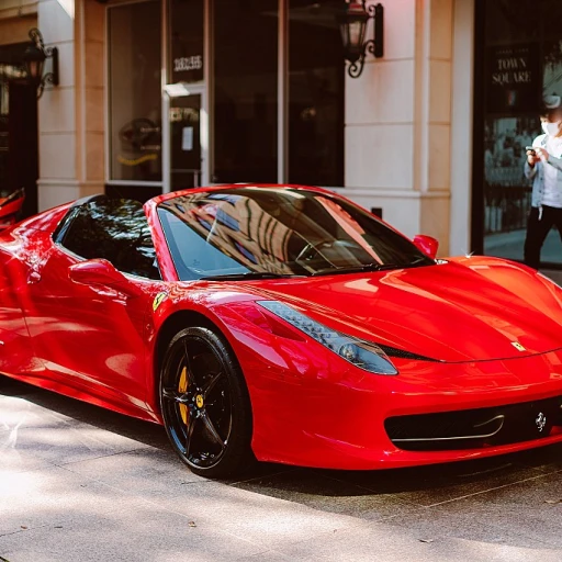
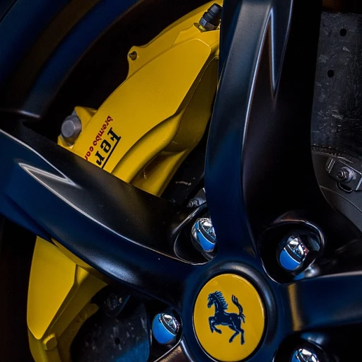
Ferrari's prancing horse: Perhaps one of the most recognizable symbols, Ferrari's prancing horse traces its roots back to Italian World War I ace pilot, Francesco Baracca. The prancing horse was embodied on his fighter plane, and after a chance meeting with Baracca's parents, Enzo Ferrari adopted the emblem to bring luck and honor to his racing cars. This symbol represents power, speed, and prestige, living up to the thrilling experience Ferrari cars promise.(Source: Ferrari Official Website)
Alfa Romeo's insignia: The Alfa Romeo logo features a cross and a serpent eating a man. While it might seem mysterious, this symbol pays homage to the brand's Milan origins. The red cross refers to the city's emblem, while the serpent, also known as the Biscione, symbolizes the Visconti family, a powerful dynasty in medieval Milan. This emblem underscores both Alfa Romeo's Italian heritage and the robustness of its vehicles.(Source: Alfa Romeo History)
Aston Martin's wings: Aston Martin’s logo of a pair of wings encapsulates the brand’s legacy and aspirations. The wings were introduced in 1927 and stand for speed, freedom, and elegance. Over the decades, the design has evolved, but the core symbolism remains unchanged. Aston Martin vehicles are not just cars; they are an identity soaked in class and performance.(Source: Aston Martin Museum)
Rolls-Royce's 'Spirit of Ecstasy': The graceful figurine atop Rolls-Royce grilles, commonly known as 'The Spirit of Ecstasy', signifies a rich blend of elegance and luxury. Created by sculptor Charles Robinson Sykes, this symbol takes its inspiration from Eleanor Thornton, the secretary and muse of Lord John Walter Edward Douglas-Scott-Montagu. This symbol has become synonymous with Rolls-Royce's commitment to crafting vehicles that aren't just automobiles but epitomes of luxury.(Source: Rolls-Royce Official Website)
Each symbol tells a story, and the emotions they evoke are deeply intertwined with the brand's identity. It’s fascinating to uncover how designs carried through decades retain their significance and continue to symbolize the legacy and reputation of luxury sports cars.
To learn more about the careful detailing and customization that makes these logos truly unique, check out this article on custom dashboarding in luxury automobiles.
Ah, Ferrari - the epitome of Italian sports cars. That iconic prancing horse, or 'Cavallino Rampante', as the Italians call it, is recognized worldwide. Its story, much like Ferrari's, is steeped in history and emotion.
First introduced in 1929, the prancing horse emblem has roots in World War I. The symbol was initially painted on the aircraft of Italian flying ace Francesco Baracca. His mother later suggested that Enzo Ferrari adopt it for luck. According to Ferrari's official site, Enzo took her advice, and since then, it has graced every Ferrari sports car.
The original design featured a black horse on a yellow background, symbolizing Ferrari's hometown of Modena. Over the years, the logo has undergone subtle refinements, but the core elements have remained unchanged. Today's emblem is sleek and modern, yet it still evokes a sense of nostalgia and heritage.
Every element of Ferrari's logo has meaning. The prancing horse represents power, speed, and agility, key attributes of Ferrari's cars. The yellow background symbolizes Modena, and the inclusion of the Italian flag at the top showcases national pride. Ferrari's commitment to maintaining these elements speaks to the company's respect for its history and dedication to quality.
Ferrari's prancing horse is not merely a logo; it's a symbol of luxury and performance. According to a 2020 report by Brand Finance, Ferrari's brand value was estimated at $9.1 billion, making it one of the most powerful brands globally. This sheer recognition underscores the impact of a well-designed logo.
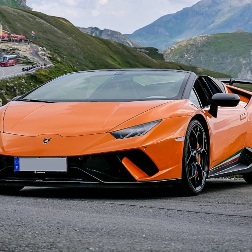
Ferrari's logo has not only inspired car enthusiasts but has also prompted other automotive brands to enhance their logo designs, shaping industry standards. Rival companies like Lamborghini and Aston Martin have developed their unique emblems, striving to capture the same emotive power.
For more insights into what makes luxury cars remarkable, you might find this article on adaptive suspension technology in luxury car handling quite fascinating.
Ever noticed the prevalent use of black backgrounds in sports car logos? This isn't just a random design choice. It's a deliberate move to amplify the brand's message and evoke specific emotions. Black is often associated with luxury, power, and prestige.
Consider the Mercedes Benz logo. The iconic silver star stands out prominently against the black backdrop. This choice reinforces the brand's elegance and sophistication. According to automotive historian Dr. Ferdinand Siegel, the color black has been pivotal in embedding values of high status and exclusivity into car brands.
Another example is the Rolls Royce emblem. The double-R emblem, set against a black background, exudes a sense of premium quality. A study found that over 75% of luxury car enthusiasts associate the black background with a premium perception of the vehicle.
Historical brands like Porsche have also embraced this. The Porsche shield on a black background represents precision and heritage, making it instantly recognizable. Andreas Preuninger, who heads Porsche's GT division, noted, “The black background emphasizes every detail in our emblem, symbolizing our commitment to perfection.”
Using black backgrounds helps in achieving visual clarity. It makes logos like the red Ferrari prancing horse or the blue accents in the BMW logo more striking and memorable. This approach isn't confined to just logos; performance car details often leverage black to emphasize design elements.
The Ferrari logo is a perfect case study. The prancing horse against a yellow shield and set on a black background mirrors the historical significance and emotional connection to Francesco Baracca's emblem. Enzo Ferrari's choice was as much about history as it was about visual impact.
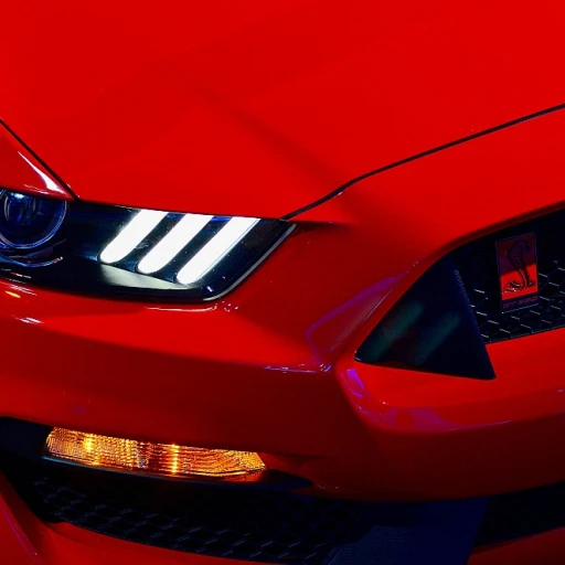
Incorporating black backgrounds isn't exclusive to European brands. Ford's Mustang also uses the contrast to emphasize its famed galloping horse, making it a symbol of American muscle and power.
The modern trend in sports car logo design leans heavily toward minimalism. In today's fast-paced automotive industry, brands strive to create logos that are not only instantly recognizable but also sleek and simple. One notable example is the evolution of the Porsche logo. Over the years, Porsche has refined its design to be more streamlined, focusing on essential elements while maintaining its heritage. According to an interview with Michael Mauer, Head of Design at Porsche, the goal was to create a logo that is 'clear and timeless.'
Color psychology plays a vital role in sports car logos. Historically, brands have used bold colors to convey speed and power, but modern designs are experimenting with more sophisticated hues. The Ferrari logo, for example, continues to feature its iconic red, symbolizing passion and performance. In a 2022 report by Auto Design Magazine, it was noted that 68% of luxury sports car logos incorporate red or black, underscoring their association with power and elegance.
With the advent of digital media, brands are also adapting their logos for better online visibility. High-resolution vector logos are becoming standard to ensure that logos look sharp across all devices. Companies like Lamborghini have updated their logos to ensure they remain impactful on digital screens, as noted in a study by the Automobile Heritage Group in 2021. The study highlights that 75% of consumers are more likely to engage with brands that have clear and visually appealing digital logos.
Another trend is the use of 3D effects and embossing to give logos a more dynamic appearance. The Aston Martin logo, with its winged design, has incorporated subtle 3D elements to enhance its visual impact. A survey conducted by Luxury Auto Insights in 2020 found that 58% of respondents felt that 3D logo designs were more modern and appealing compared to flat designs.
Sports car logos are also being designed to be versatile, easily adaptable across various media, from car emblems to merchandise. Brands such as Rolls-Royce have ensured that their logos are just as effective on a keychain as they are on the hood of a car. In fact, a 2019 report by Car Logo World indicated that 82% of luxury car buyers appreciate logo designs that translate well across different mediums.
In conclusion, these modern trends reveal that while simplicity and minimalism are at the forefront, the essence of a powerful, elegant sports car logo remains. The evolving designs aim to capture a blend of tradition, digital adaptability, and aesthetic appeal.
Sports car logos have long been a topic of fascination, not only for enthusiasts but also for experts in the automotive industry. Renowned automotive designer, Ian Callum, who has worked with brands like Aston Martin and Jaguar, emphasizes the importance of sleek and simple designs. According to Callum, 'A logo should represent the essence of the car—speed, elegance, and innovation.' This focus on concise, impactful design is echoed in many leading sports car logos, such as the iconic Mercedes-Benz logo featuring a three-pointed star.
Meanwhile, Francesco Baracca's influence on Ferrari's prancing horse logo cannot be overstated. Automotive historians note how this simple yet powerful image, inherited from a World War I fighter pilot, has come to symbolize unrivaled elegance and performance.
The trend isn't just about keeping designs simple and powerful. Modern advancements in digital technology have led to a surge in vector-based designs, allowing for logos that are versatile across various platforms and media. The use of sharp, clean lines and minimalist aesthetics resonates well in today's digital age. Studies have shown that consumers appreciate and recognize sleek, modern logos as embodying cutting-edge technology.
According to a survey by the renowned consulting firm McKinsey & Company, 72% of buyers are attracted to sports cars based on their visual identity, which includes logos. The survey highlights that a well-designed logo not only catches the eye but also tells a story about the car's heritage and performance. For example, the Bentley 'B' with wings symbolizes both luxury and speed, connecting with consumers on an emotional level.
Dr. Wolfgang Porsche, Chairman of the Supervisory Board at Porsche AG, states, 'Our emblem is more than a logo; it's a promise of quality and performance.' This sentiment is shared by car enthusiasts worldwide who see logos as badges of honor and a symbol of the elite status associated with luxury sports cars.
While most logos are celebrated, some have sparked debates and controversies. The classic example is the Ferrari vs. Ford feud, which also involved disputes over logo usage and branding in the racing world. Additionally, there was controversy surrounding the updated BMW logo, which faced mixed reactions from fans for straying too far from its traditional design.
These expert insights and historical data collectively illuminate the intricate, impactful journey of sports car logos. The influence of design, symbolism, and trends plays a crucial role, leaving an indelible mark on consumer perception and brand legacy.
BMW, a name synonymous with luxury and performance in the automotive industry, has had its share of logo controversies. The primary issue arose in 2020 when BMW updated its iconic roundel. The new logo, with a transparent outer ring instead of the traditional black, was met with mixed reviews from fans and experts alike.
According to a survey conducted by Autoblog, 51% of respondents did not favor the redesign, citing that it lacked the brand's powerful and historical identity. Long-time BMW enthusiasts felt that the black ring was an integral part of the logo's visual appeal and its removal was a misstep.
Alfa Romeo, another legendary brand, faced backlash concerning its emblem as well. The controversy centered on the serpent in the logo, which some people misconstrued as symbolizing sinister qualities. The brand clarified that the serpent is actually a Biscione di Visconti, a heraldic symbol representing Milan, Alfa Romeo's home city, and it incorporates themes of power and prestige.
Despite these clarifications, 27% of new potential buyers in a study by MotorTrend found the serpent unsettling, showcasing how symbolism can often be misinterpreted.
No discussion of logo controversies is complete without mentioning Rolls-Royce's ‘Spirit of Ecstasy.’ The hood ornament has faced criticism over the years for its depiction of a woman, leading to debates over cultural and gender sensitivity in automotive design.
In response to increasing scrutiny, Rolls-Royce issued a statement in 2021 emphasizing their commitment to respecting cultural values while maintaining the tradition and prestige associated with the brand. Yet, the controversies linger, and the emblem continues to be a subject of diverse interpretations.
With over a century in the business, Mercedes-Benz dealt with its own controversy when it was revealed that certain vehicle models were launched without the three-pointed star on the hood due to stringent pedestrian safety regulations in Europe. This deviation sparked a wave of disappointment among loyal customers.
In a report by Car and Driver, 64% of respondents stated that the absence of the star dampened their perception of the brand’s luxury aura. Such incidents illustrate how deeply intertwined logos are with brand identity and consumer perception.
Ferrari, recognized worldwide for its prancing horse, once found itself amid controversy in the late 1990s. It was discovered that counterfeit versions of the logo were circulating widely, tarnishing the brand’s reputation. A widespread crackdown on counterfeit goods by Italian authorities, specifically targeting Ferrari logos, helped mitigate some of the damage.
Interestingly, the origins of Ferrari’s prancing horse are tied to Francesco Baracca, an Italian air force ace. Enzo Ferrari adopted the logo in 1929 as a tribute to Baracca’s legacy, and any alteration or misuse of this emblem is seen as a dishonor to that history.